
Paper prototype testing
Paper prototyping
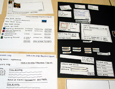
Interfaces for the blog system were sketched out by the development team during brainstorming sessions. These design sketches were then used to create a prototype of the blog system using basic supplies such as paper, pens, scissors, and glue. Almost all screen interactions can be replicated using these supplies.
 (click to enlarge)
Five students volunteered to take part in evaluating the paper prototype. During each session, one member of staff from ITS Web Team acted as the 'computer' and moved the relevant pieces of the prototype into place based on the actions of the participant. Another member of staff acted as a facilitator and note taker. Each session was videoed with the participant's agreement.
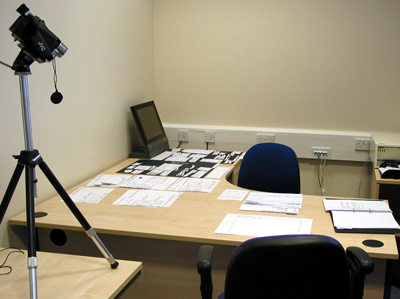 (click to enlarge)
Results
These are the results from the usability study using the paper prototype. The findings that caused users most concern are shown and possible solutions are listed.
Entries
***Text modifiers (major issue)
Most users tried to highlight the text and then click on the text modifier instruction.
Possible solutions include:
Buttons that would insert the correct text modifier
Examples of how the text modifiers should be used
***Photo gallery (major issue)
When presented with a task to add an entry with a photo, all users chose the ‘photo gallery’ option.
Possible solution:
Change this option to ‘Entry with photo(s)’ and show a version of the standard entry screen that emphasises ‘adding images’.
**Book review (minor issue)
Some users were confused about whether or not they had to enter title, author and ISBN.
Possible solutions include:
Stating ‘Book Title’ OR ‘Author’ OR ‘ISBN’
Changing the ‘next’ button to a ‘search’ button
Options (minor issue)
None of the users understood ‘Ping’ or ‘Trackbacks’. There was a help icon next to these items but none of the users elected to click on it.
Possible solution:
Not sure! This could be tested during the next usability study.
**Restricting an entry to one individual (minor issue)
One user wanted to restrict an entry to just one individual. The user created a new group and added just the individual to that group. The user then selected ‘read’ and ‘comment’ for that group under the ‘options’ when creating a new entry.
Possible solution:
Add the facility to restrict an entry to one individual next to the groups under options
Groups
***Adding a new group (major issue)
Several users found that they could add new categories when creating a new entry. They were subsequently confused when they couldn’t add a new group from this point as well.
Possible solution:
Allow users to create new groups when creating a new entry. Add a ‘create new group’ link next to the groups under the ‘Options’ button.
*Go and Done buttons (minor issue)
Some users were confused over the difference between the ‘go’ and ‘done’ buttons on the groups screen.
Possible solutions:
Make sure that these buttons are visually separate
Move ‘create a new group’ to the top
**Searching for a user code (minor issue)
Some users didn’t realise that they could click on the user code listed in the search results.
Possible solution:
Add an instruction to say something like ‘click on the user code to add the person to your group’
Categories
**Default (minor issue)
Several users were confused about what the ‘default’ meant when creating or editing a category.
Possible solution:
Include a help icon next to default
*Description and keywords (minor issue)
There was some uncertainty about what constituted description and/or keywords.
Possible solution:
Provide an example for each, perhaps in a pop up window.
Questions which users raised that could not be answered during the study:
Will individuals in a group be notified when something new is added for that group?
How would uploaded files (such as a word document) show on an entry?
Modifications
Based on these results, the paper prototype was modified and photographed to act as a record of the proposed interfaces. These photographs were then used to develop the screen interfaces of the blog system.