
Home page principles
Designing a good home page can be difficult. Everyone wants to have their say, influence how the page looks and have a link to their service. However, if you stay focused on your audience's needs and follow the principles in this article, you'll create a home page that has visual impact and serves your audience well.
In this article:
Use a visual hierarchy of information
You should already know what your audience is looking for from your audience research, and have a list of top tasks. Put the information that serves each task on your home page as blocks.
A visual hierarchy shows information in priority order and how information relates to each other. You can create visual hierarchy by:
- placing the most important information at the top left
- placing secondary or lower priority information further down the page
- showing equal priority with a row of content blocks
- grouping related content together
- using both heading and paragraph styles to denote section headings and related content
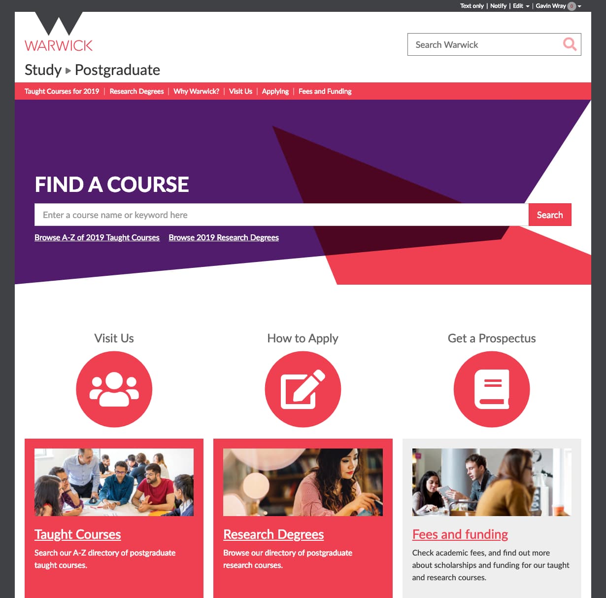
For example, the course search is the most important item at the top of the Postgraduate Study home page. Next, there are the calls to action: ‘Visit us’, ‘How to apply’ and ‘Get a prospectus’.
Copywriting
Home page design can quickly become a conversation about images, colour, icons or other visuals. However, your audience will be looking for words in the page that ‘satisfice’ what they want to find. For example, ‘Order a prospectus’, ‘Module registration’ or ‘Book a place’.
Write the actual words in the home page design rather than use placeholder text like lorem ipsum. It takes longer than you might think!
Also, cut as much text as you can. Condense the text to the essential information your audience needs to find what they're looking for or accomplish a task. Doing so:
- makes the necessary content more prominent
- reduces visual noise
- makes the page shorter
Avoid starting paragraphs with messages like ‘Welcome to our website’. It uses valuable space and no one reads it.
The University's Engagement Group provide training on copywriting through the Learning and Development Centre.
White space
White space gives users' eyes a place to rest and differentiates sections in the page, making it easier to scan. If you cram too much information on a home page, visitors cannot discern what information is important.
Try to think of effective road signs. The most important information is large and at the top. Lower priority information is smaller. The sign has plenty of space, ensuring drivers can read it at speed as they pass by.
When faced with demands to ‘fill the space with more links’, refer to your audience research and top tasks. If adding more content does not serve the audience's needs identified in your research, don't put it on the home page.
Focus on your audience
Stay focused on your audience's characteristics and needs identified in your research. Think about what your audience will like, not what you like!
Speed, scan, satisfice
People work quickly when browsing the web. Remember this when designing your home page. Try and work with the behaviour rather than against it.
Keep control
This is a really important point, particularly in large departments. Everyone will want links on your home page. You need to have control and the authority to say no. Everything on the page must have a purpose and serve your audience.
Tips:
- Avoid design by committee – by satisfying everyone you'll get the lowest common denominator of quality. Your design will not be focused on serving your audience.
- When in doubt or you need to justify a decision, go back to your audience research and top tasks. This defines the hierarchy of information on the home page.
- Filter personal opinion and seek objective criticism – for example, ‘red may not be the appropriate colour to represent the caring, sensitive nature of the nursing sector’ is more valuable than ‘I just don't like red’.
Related links
Contents
Advice and support
webteam at warwick dot ac dot uk
webaccessibility at warwick dot ac dot uk